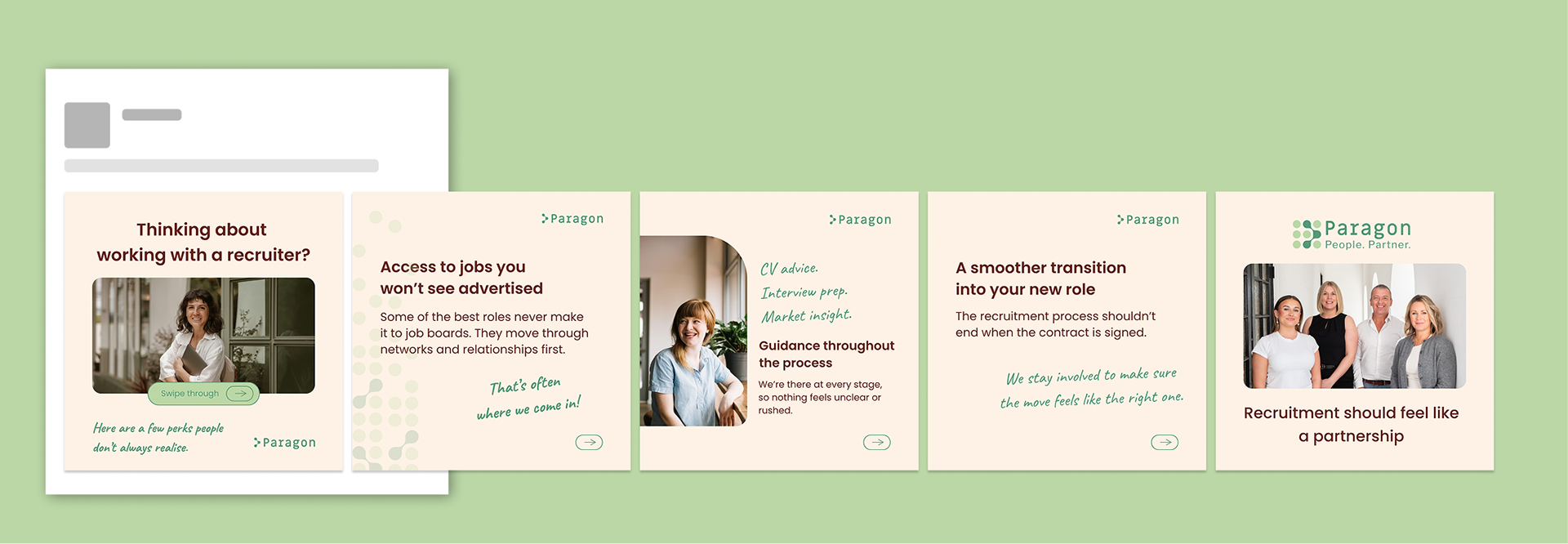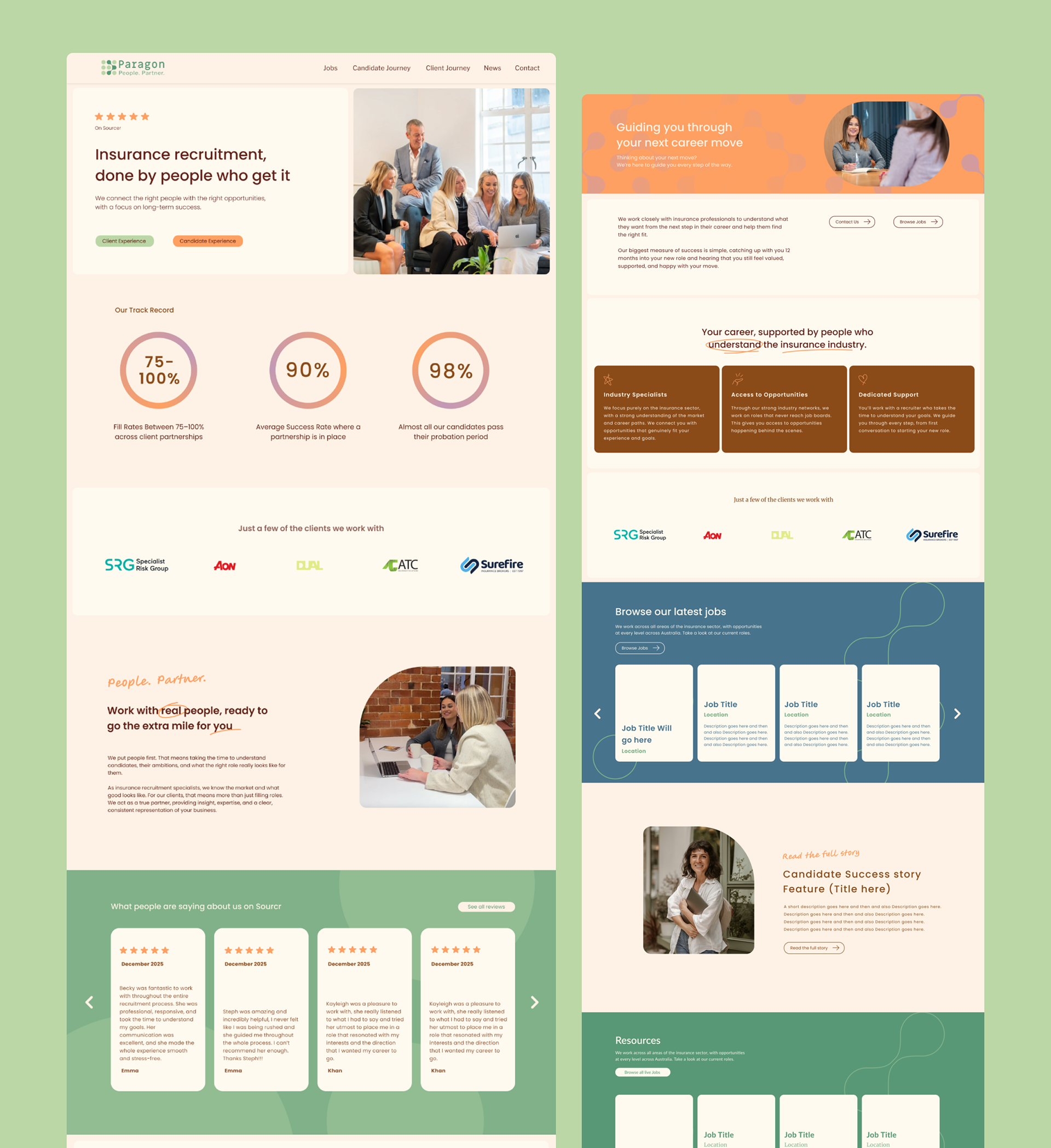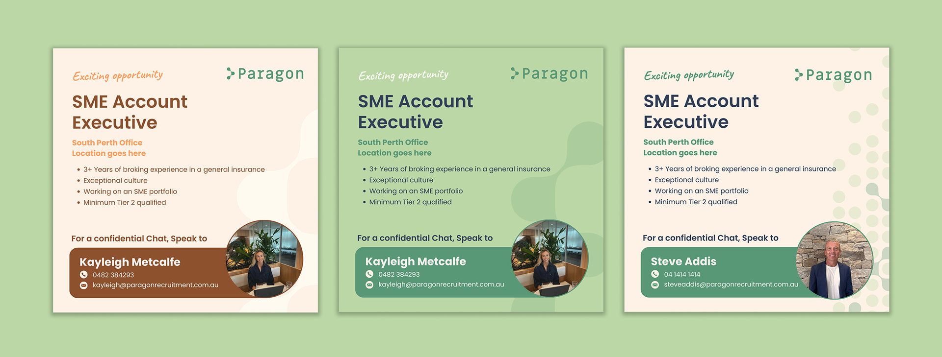
The existing brand felt dark, corporate and slightly outdated, and its social media presence lacked consistency, so my goal was to create something fresher, more approachable and more reflective of the people behind the business.
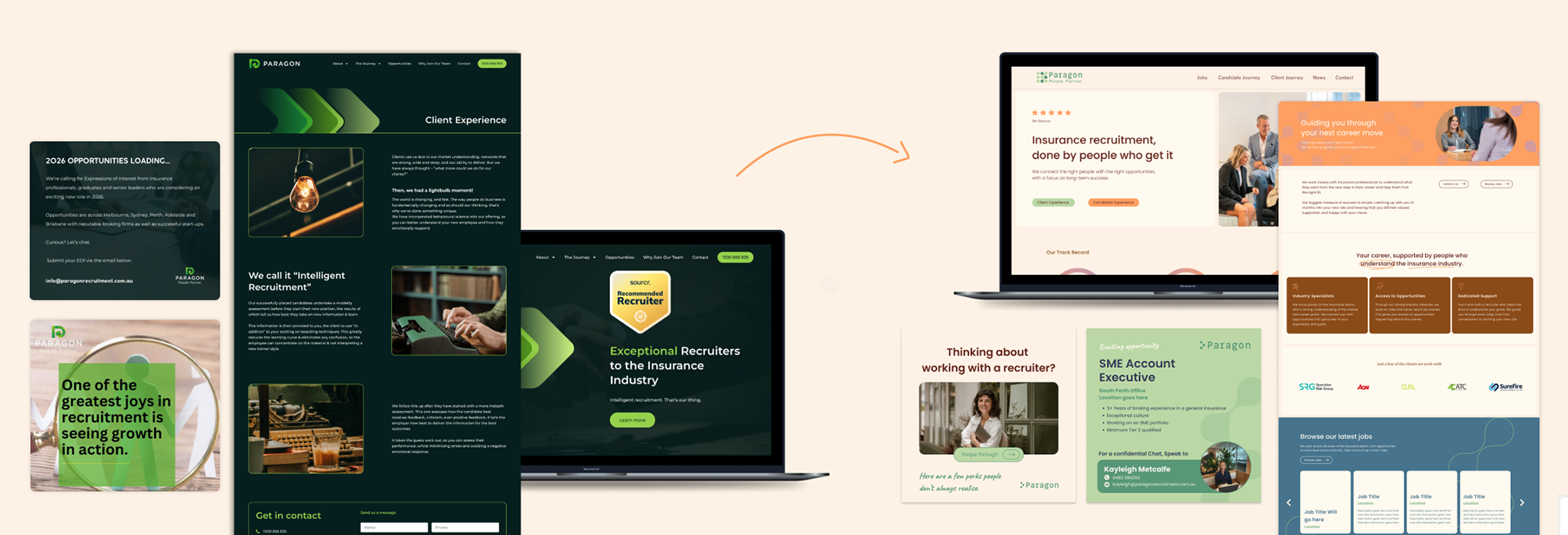
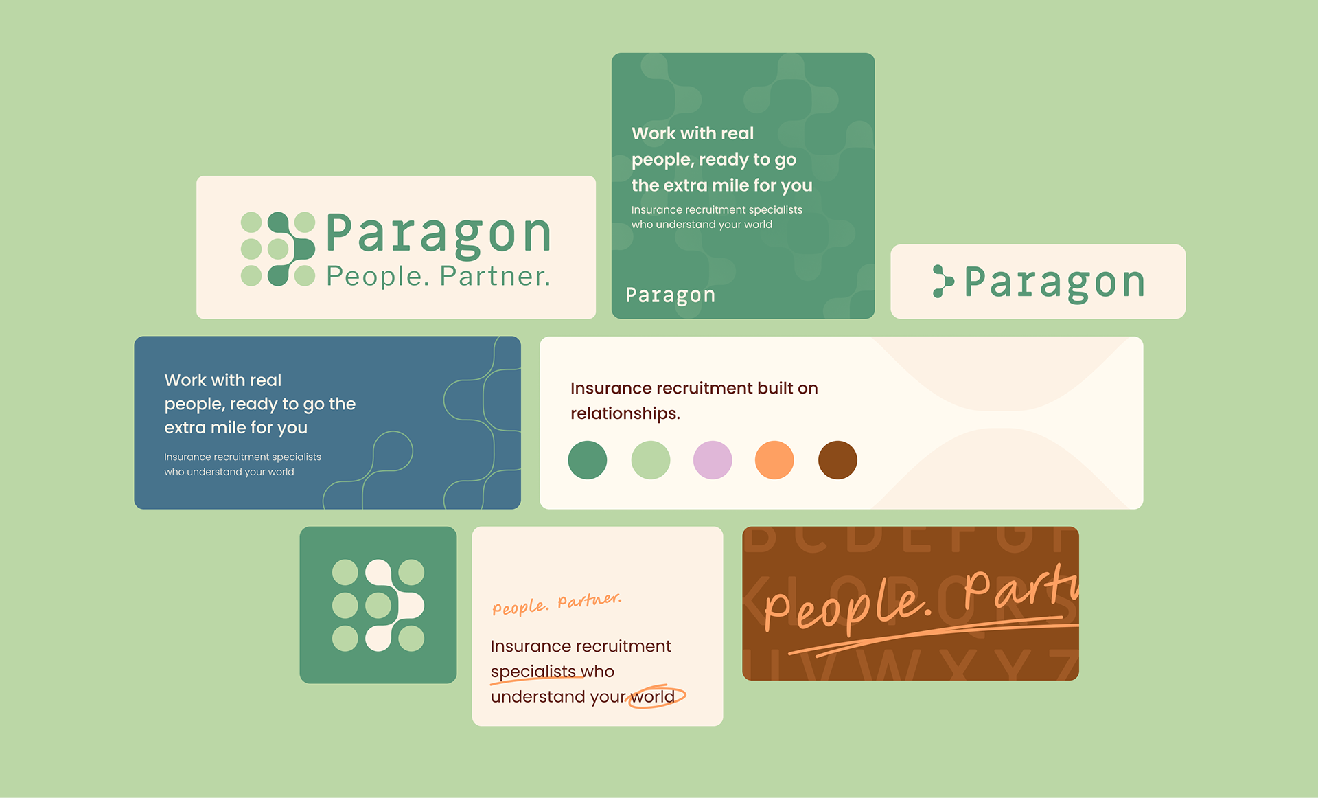
Early concepts explored themes of connection and partnership, focusing on subtle visual cues that reflected the relationships at the heart of the recruitment process without relying on overly literal or cliché representations.
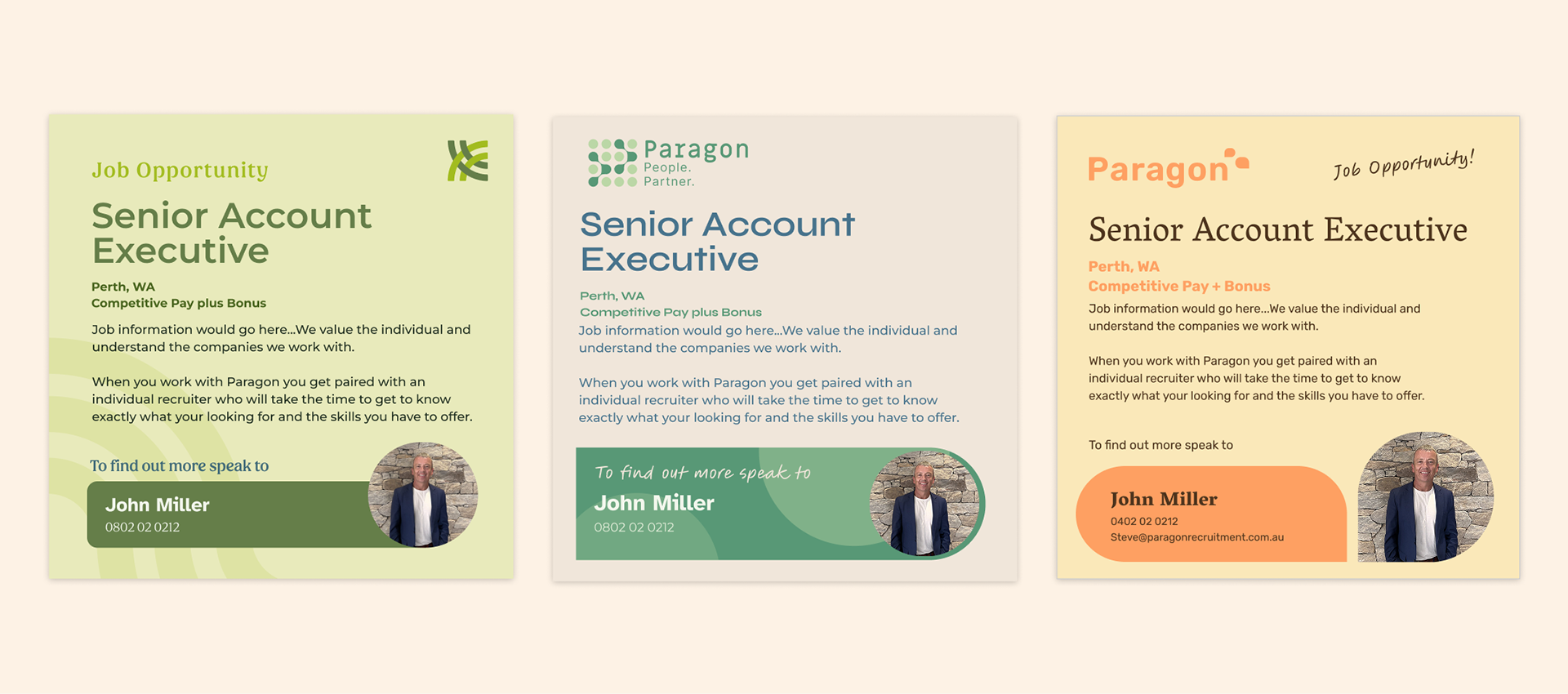
The final logo and brand identity reflect Paragon's mission of connecting people. A refreshed colour palette, featuring lighter tones and warm accent colours, was introduced to create a more inviting and approachable feel. Handwritten elements add personality and help emphasise the human side of the business, balancing professionalism with warmth.